
A new appearance
Yay, Refining Linux got a face-lift!
This blog has now been up for a good one and a half year and nothing has changed much since it started. Now it’s time to give it a redesign (if you ask me, this was long overdue). While the main appearance stays the same, the details have changed significantly. Let me walk you through the new goodies.
Responsive design
The most awesome feature first: the whole design is now completely responsive and can be viewed at any size. The old desktop-only design has been replaced by a brand-new flexible design for any kind of device, be it a small smartphone, a bigger tablet or a giant 30” display. Refining Linux has it all.
If you like, you can test this. Just resize your browser window and see how great the new design adapts to the new width. The minimum size I consider looking well is about 240 pixels, but there is no upper limit. It just might start looking a bit ridiculous if you project a tiny page onto your 5k display wall. ;-)

Nicer typography
Although Georgia and Verdana are not the worst choices I made in my life, they don’t look very pretty. They’re old veterans of the web-safe fonts battalion and have gotten a bit long in the tooth. Nothing against these fonts in general, but it was time for something different. I mean, we live in the age of web fonts, don’t we?
The new choices are Clarendon Paint and Aller, two fresh fonts for the new look and feel of Refining Linux. I like both and think they support the overall painted appearance.

Improved Header
Not only the body has been refurbished, also the header has been pimped. It was actually the last thing I took care of, but that doesn’t mean it’s not important. It is. Our little painting Tux has become a bit more lifelike, the background painting a bit more realistic. I also took care of the main menu. It got some more detail, less straight edges and some subtle CSS gradients for the hover effect.
In general I haven’t modified much in the header, but again, the details have changed. It’s perfectly possible that some things in the header might still be tweaked from time to time, but for now I leave it as that.

Redesigned comments section
The comments section has especially been taken care of. It looks very different now and much better in my opinion. The speech bubbles make a lot more sense this way and the overall look is much cleaner and more pleasing to the eye. I hope you like it as well.
The amount of indentation has grown a bit with the redesign, so I have limited the maximum number of indents to four (plus the root level, i.e. five). Comments already being submitted at a higher nesting level retain their position in the database but their display is linearized at the fifth level.
Also the comments form (and the contact form as well) has been redesigned slightly. It also looks a lot cleaner now and I put in some nice HTML5 form validation features there (more on that in a second).

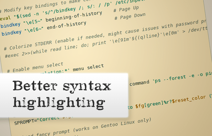
Better syntax highlighting
The syntax highlighting has much been improved. Instead of SH_JS I’m now using Highlight.js which gives me way more accurate highlighting and particularly more control. Especially for the last Advent series I created a special ZSH highlighting scheme. I couldn’t really do that in SH_JS without having to learn GNU Source Highlight (I’m too lazy for that).
The new color scheme for the syntax highlighting is based on Ethan Schoonover’s famous Solarized theme. Personally I don’t like Solarized too much for my editor (the colors are too muted to my taste), but for the website, I believe, the bright theme is great.
Yes, there are still some glitches here and there in the highlighting, but I guess I will be able to fix them over time. The highlighting as it is now is already tremendously better than it was ever before.
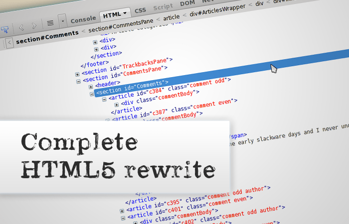
HTML5 rewrite
The whole page has been rewritten in HTML5. This wasn’t necessary, but I did it in the process of making the whole thing responsive. It now uses semantic HTML5 markup and of course also goodies like HTML5 input type validation for the comments form, a new Canvas tag cloud (replacing the old and ugly Flash tag cloud) and much more.
The tag cloud, by the way, should be completely accessible as it is based on a normal list of links. Users with very small screens, touch based devices or disabled JavaScript will get that version instead. Also screen readers should be able to access the fallback version.
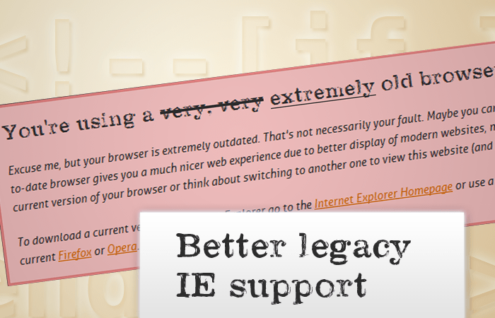
Better legacy IE support
Although I don’t care much, a nice side-effect of the responsive design and its “mobile-first” approach is that the support for IE6, 7 and 8 is much better now. IE9 renders everything fine and just lacks support of some minor things such as gradients without SVG. IE8 and older, however, does horrible things to the layout, especially with the new unknown HTML5 elements which I can only get to work with JavaScript. But with the mobile fallback and a few minor fixes I got a more or less decent but at least working version for old IEs. With JavaScript enabled it looks a little less horrible, with JavaScript turned off a little more. But overall it’s all working and the two IE users I have will get a very rough but usable basic version of the website (actually, it’s a bit more. I have about 7-8% of IE users here of which about a quarter uses IE 9 or above. In December the IE rate was even as low as 5.7%).
Enjoy!
I hope you enjoy the redesign as much as I do. If you like, you can help me a little by doing some browser testing. Although I have tested this on Linux and Windows in many browsers, there might still be some glitches here and there. If you find some, please let me know.
Have fun! :-)